
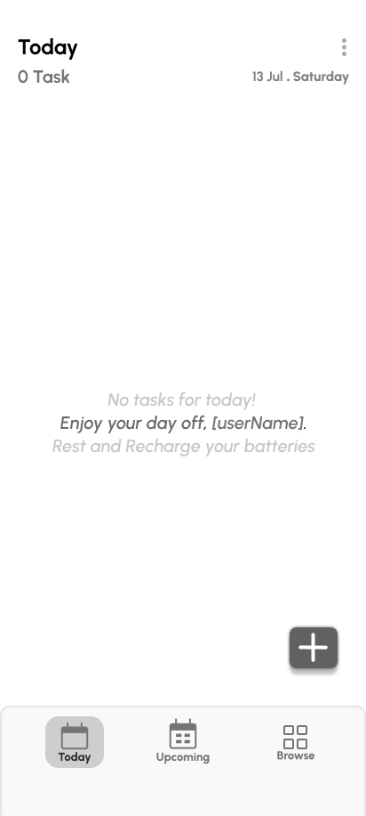
In today’s digital landscape, task management tools often overwhelm users with cluttered interfaces, excessive features, and constant notifications, making it challenging to focus and prioritize effectively. Knowledge workers, students, and professionals alike face the growing challenge of maintaining concentration amidst frequent interruptions, app-switching, and digital distractions, which result in fragmented work sessions and diminished productivity. Traditional productivity apps—including timers, to-do lists, and ambient sound tools—often fail to address these issues, offering uninspiring designs, fragmented experiences that require toggling between multiple apps, limited progress tracking, and complex, cluttered UIs that only add to mental fatigue. Focus Flow addresses these pain points by offering a minimalist, intuitive to-do list app that emphasizes simplicity and clarity. With its clean interface and streamlined design, Focus Flow helps users stay focused, prioritize tasks efficiently, and track their progress, providing an environment that fosters productivity without unnecessary distractions or cognitive overload.
Problem Statement
In today’s digital workspace, task management tools are often cluttered, overwhelming users with excessive features and notifications. Users seeking simplicity and focus struggle to find a tool that helps them prioritize tasks without distraction. Focus Flow addresses this challenge by offering a minimalist and intuitive to-do list app that promotes clarity, flow, and productivity through a clean interface and structured experience. The goal of the app was to create a simple, user-friendly, and visually appealing task management tool that helps users prioritize tasks, stay focused, and increase productivity.
Opportunity
- Unified experience: Combine timer, ambient sounds, and task-tracking into one cohesive tool.
- Emotional & visual motivation: Use a calming yet engaging visual style to encourage repeated sessions and habit formation.
- Progress visibility: Provide clear feedback on sessions completed, streaks, and productivity gains.
- Minimal friction: Make the core interaction (starting a focus session) as simple and fast as possible.
Project Goals
- Create a simple, intuitive task management system focused on clarity and usability.
- Enable users to organize tasks effortlessly by date, category, and priority.
- Support a smooth daily workflow with focused navigation and minimal cognitive load.
- Encourage users to stay consistent and productive through time tracking and reminders.
User-Research
- Target users: Students, freelancers, remote workers, anyone struggling with maintaining focus for extended period of time.
-
Key insights :
-
Many users reported using multiple apps just to manage focus: one for timer, another for ambient sounds, another for task tracking.
-
Users desired less friction in starting focus sessions and switching into “work mode”.
-
Motivation wanes when the UI or experience feels punitive or overly complex.
-
Competitive/Market Analysis
- Reviewed popular focus/timer apps and habit-trackers: found that many had gamification-heavy design or rigid reward systems which alienated some users.
- Identified potential gap: a soothing, non-gamified but structured tool that helps build focus habits through clear progress and ambient supports.
Personas & User Journeys
- Persona A: “Maya, 21, university student” — often tries to study but gets distracted by phone notifications and social apps. Wants 25-minute focused blocks with minimal setup.
- Persona B: “Ravi, 28, remote freelancer” — needs to block deep-work time, manage tasks, and reduce context-switching.
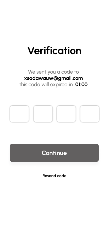
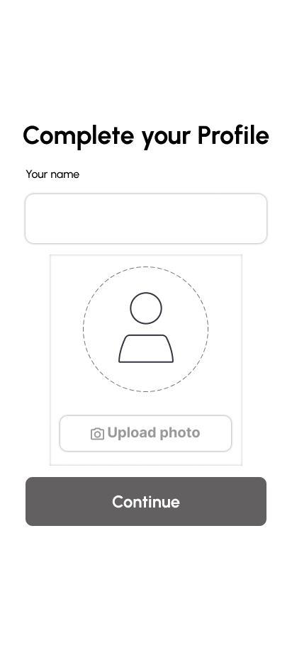
- Key journey: Open app → Start a focus session → (Optional: select ambient sound mix) → Work for session → Break period → View progress & tasks done.
Design Process and Solutions
Ideation
Brainstorming sessions focused on reducing friction in daily task management. Key decisions:
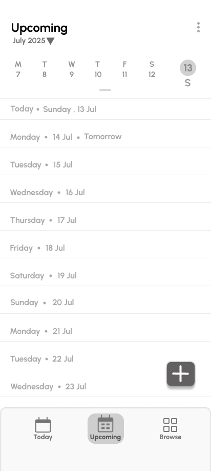
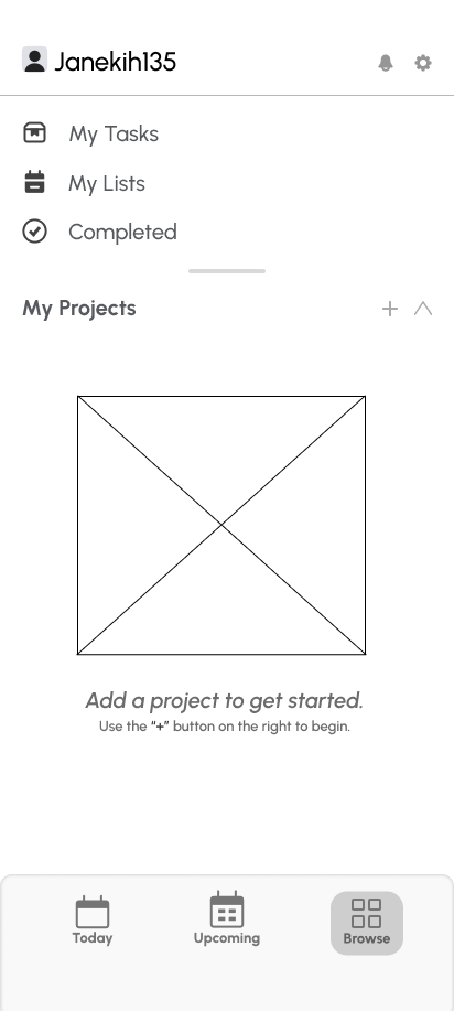
- Prioritize Today, Upcoming, and Browse as the core navigation pillars.
- Keep actions context-based: the floating “+” button adapts to the user’s current view.
Information Architecture
.png)
User Flows
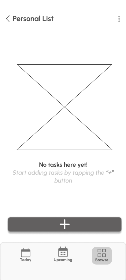
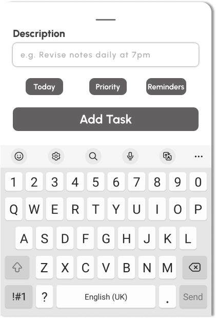
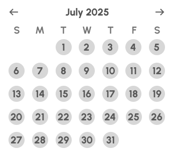
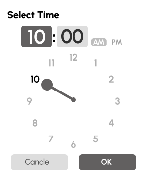
Wireframes


Color Palette

Final Designs Prototype
Reflection
Designing and developing the Wake Up Coffee website using WordPress was a rewarding experience that strengthened both my creative and technical skills. This project allowed me to translate a conceptual brand identity into a fully functional, user-friendly digital platform. Working with WordPress gave me the flexibility to design a visually cohesive site while maintaining ease of content management for future updates.
One of the most valuable lessons I learned was how to balance aesthetic appeal with usability. I experimented with typography, color harmony, and layout structure to create a warm, inviting feel that reflects the café’s personality. At the same time, I focused on responsive design principles and accessibility to ensure that the website performs smoothly across all devices.
Throughout the process, I also became more confident in customizing WordPress themes, optimizing performance, and improving user experience through thoughtful design decisions. Overall, this project deepened my understanding of how design and development come together to create an engaging brand experience online — one that not only looks good but also serves its audience effectively.